SOUR JO’S
Made in the sunset.
The Opportunity
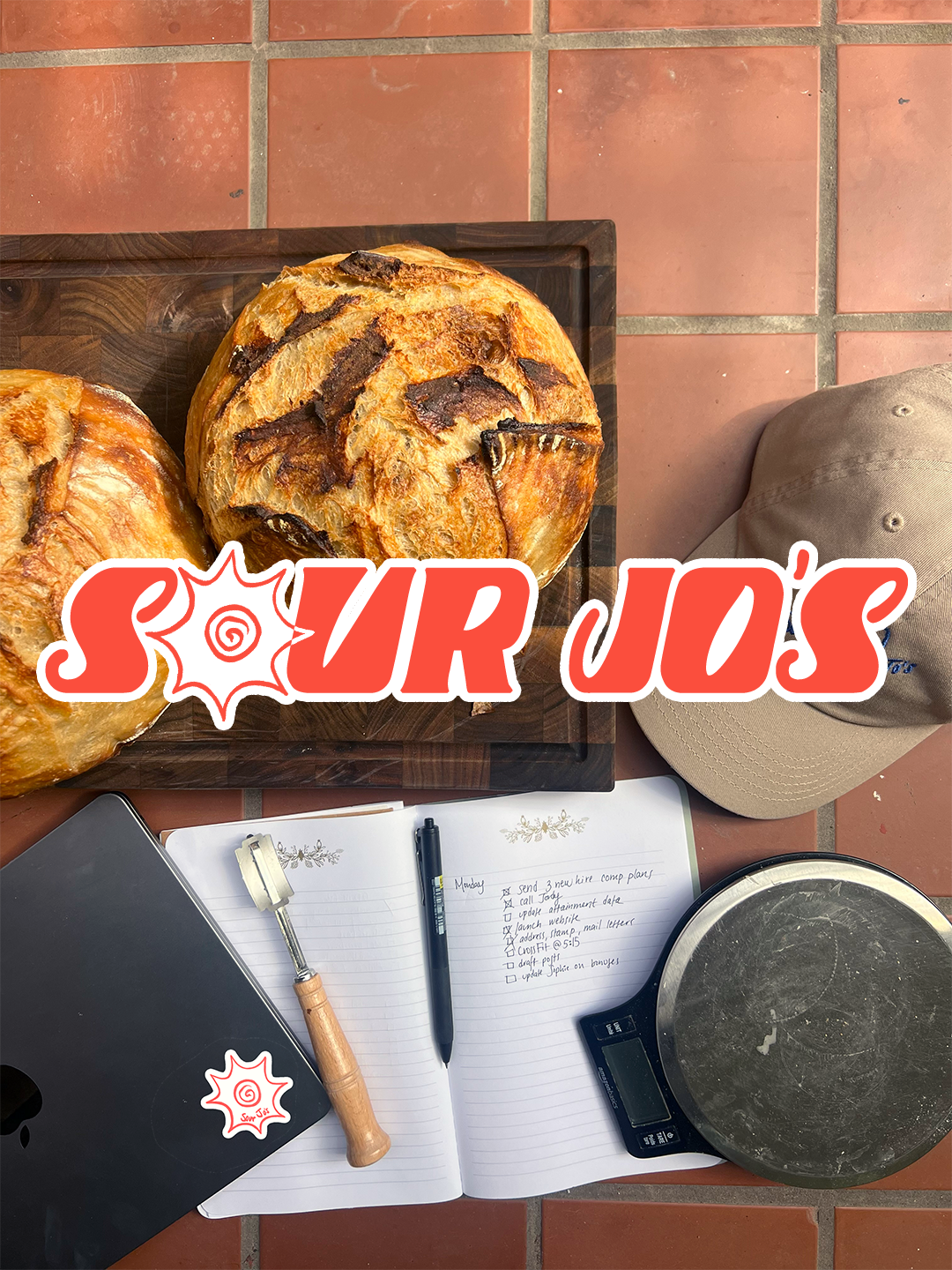
Sour Jo's is a micro-bakery born in San Francisco, specializing in sourdough bread and granola, rooted in community and connection. As the brand transitions from apartment dinner parties to an established Outer Sunset bakery, it requires a brand system, visual identity and web experience that reflects the warm, quirky, and "made in the Sunset" spirit of the brand.
The Approach
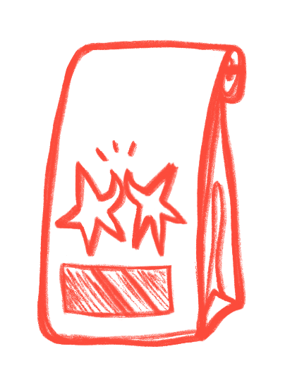
Drawing from the coastal neighborhood’s golden hour culture, the founder’s active lifestyle, and the sentiment that food is best enjoyed in the company of others, this character-rich brand system was developed with hand-drawn illustrations at the center. It orchestrates unique brand identity full of life—complete with a pre-existing handwriting font—that still feels balanced with the use of high contrast block type and color.
The Result
A deeply personal, playful, yet polished brand identity and web experience that is ready to grow as the company scales. The design system balances the founder’s personal touch with clean creative direction to translate across web design, owner-designed merch, future packaging, and community initiatives to give Sour Jo’s a flexible framework for long-term growth.
Branding · Creative Direction · Art Direction · Product Design · Illustration · UI / UX Design
First Creative Collaborator · 2026
Logo & Illustration Design






BRAND DESIGN
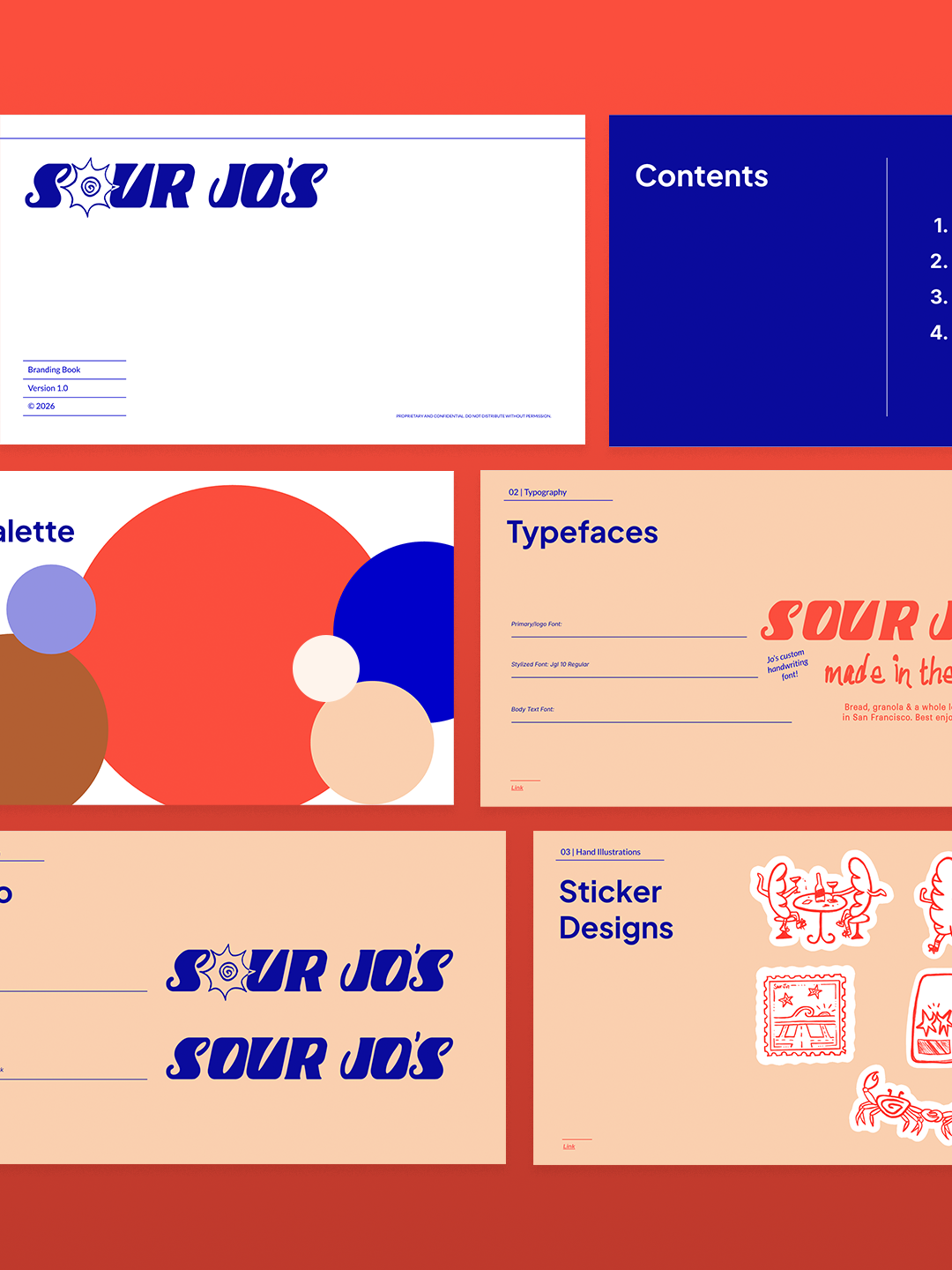
Brand Identity & Brand Guidelines
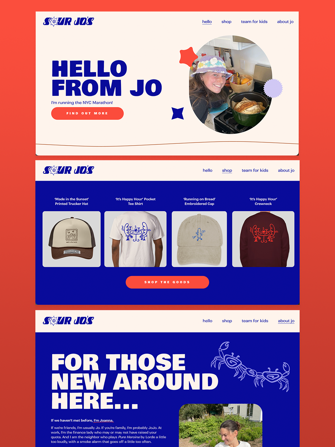
Website Design
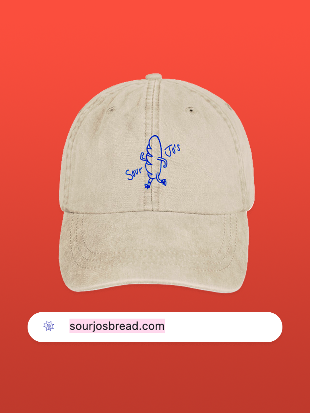
Founder Merch
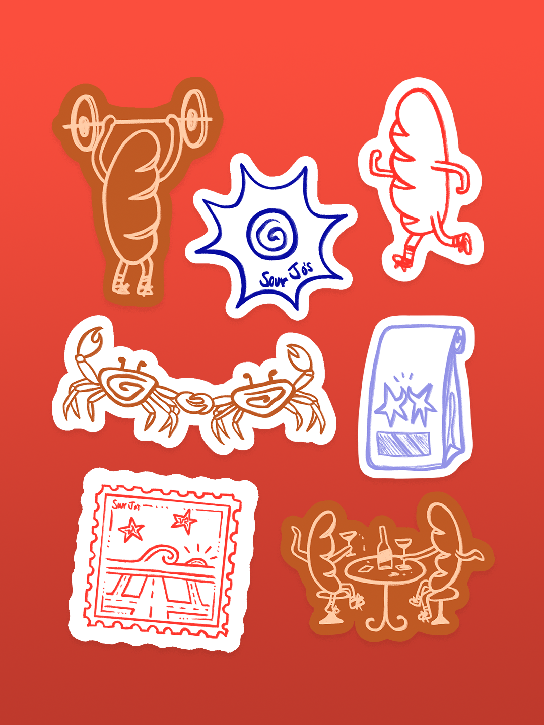
Illustrations & Stickers